

In the digital age, conciseness is just as important as accessibility. It is easy to overload customers with information. An infographic – a visual representation of data or knowledge – is the perfect way to distil your message for any audience. Infographics use minimal text combined with visual representations such as data and pictures. And if a picture is worth a thousand words, an infographic is worth ten times that. Infographics can be used to convey any information, such as your company timeline, key statistics, or your founding aims. It is not a novel gimmick either; infographics have been used throughout history and continue to be popular today.
In this article, we will explore some of the uses of infographics, the benefits of including them in your marketing strategy, and examine some of Squideo’s favourite examples.
What can an infographic be used for?
Like pictures, infographics are easily shared and can be repurposed over and over again. From a social media post, an infographic could be repurposed for an annual report or added to a corporate video. They provide a quick overview of any topic and simplify complex processes. Here’s a few examples:
- Present research or survey data with a percentage focused infographic
- Summarise a report with an infographic of key statistics
- Compare or contrast two or more options with a dual list infographic
- Simplify employee onboarding with an infographic staff hierarchy
- Raise awareness with an infographic highlighting key issues affecting a community
How to make an infographic
A simple infographic is easy to make using any design platform, like Canva or Adobe. First, decide what information you want to present. You should focus on one main topic, such as your achievements over the past year. Once you have chosen a topic, decide the best way to display this. If you have data, condense this into two or three graphs rather than lengthy sentences. Finally, ensure an easy flow from one image to the next. An infographic should be like a storybook, leading the audience on a journey.
Our favourite infographics
For inspiration, look at some of our favourite infographics and learn what makes them effective and how a similar graphic could give your business a boost.
The Global Carbon Budget: World Resources Institute
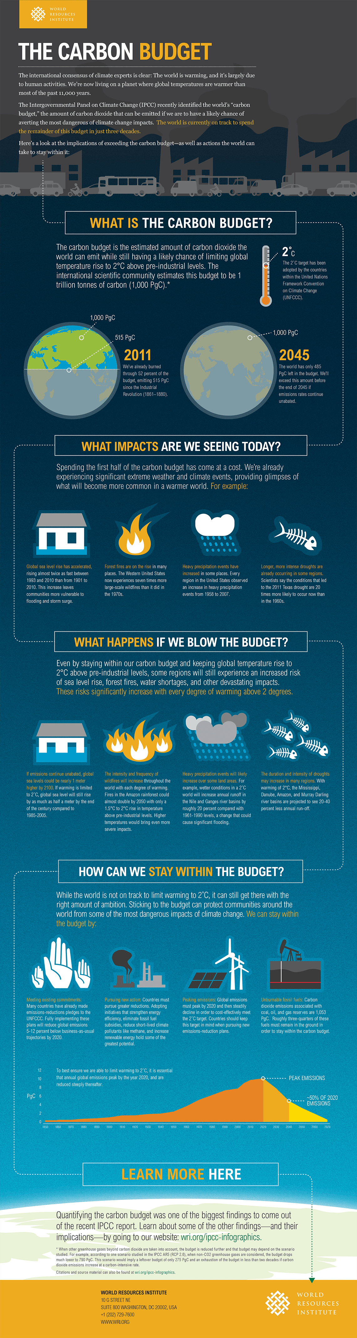
When the subject is as serious as global warming, it is important to get your message right. The World Resources Institute used a mixture of headlines, text, animation and graphs to concisely show its audience the issue, the consequences, and potential solutions to global warming. This clever design has a gradual background change to replicate travelling through the Earth’s atmosphere, a fitting choice given its subject.
Soldier Fatalities: Poppy Field

This strikingly simple infographic uses minimal text, but this doesn’t detract from its ability to create a poignant message. Poppies are used to represent a timeline of global wars and the cost of human life in each. The stems of these flowers connect to a line graph axis with the matching date, and the size of the flower head matches the total death count. For an organisation created to commemorate the centenary of WWI, this infographic perfectly summarises the organisation’s aims and message.
For a professional quality infographic to rival some of these fantastic examples, Squideo’s talented team of graphic producers can create an infographic that perfectly condenses your brand into a single image and uses visual elements to help get your message across to your audience.
To find out more about our infographics and other graphic design options, get in touch with the team today.